
Showit is a dream of a website platform. Both designers and business owners rave about Showit because it’s stupidly easy to use and presents very few limitations when it comes to design. But more than how fun and simple the platform is, Showit also offers a very interesting option when it comes to blogging.
Here’s what you actually need to know (and nothing more) about blogging on Showit.
Showit uses WordPress as its blogging platform.
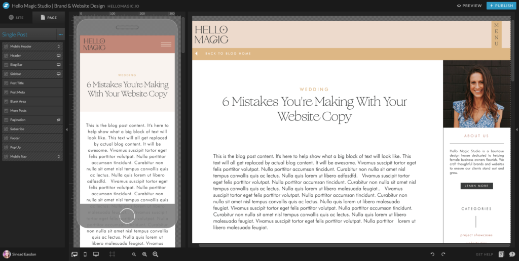
Showit is the pretty face of your business. It’s stunning, easy to use and easy to edit. There’s no coding (NONE). We use Showit to decide exactly what your blog home and your individual posts will look like. We’ll decide everything from fonts to colours, to layouts, add a sidebar, add the menu and footer and anything else you’d like.
When the Showit templates are set up and the blog is live, WordPress is where the magic will happen! You’ll log in to your WordPress account as provided by Showit, click “Add New Post” and simply write out your blog content. You’ll get access to all of the SEO goodies that WordPress is known for (like the Yoast SEO plugin) so you can easily optimise your writing.
After posting, Showit will pull the content onto your live site and display it using your template design.
Want a visual? Watch this video.
If you already have blog content on WordPress or Squarespace, you can migrate it to your Showit website
Yeah! Does that sound like very good news? A big hurdle for established businesses who’ve been blogging for a while is keeping that content connected and integrated. Getting a better-looking website shouldn’t mean you lose all that hard work!
If your blog is currently hosted on WordPress or Squarespace, the Showit team will migrate your posts for you and ensure everything is up and running. You’ll be able to pull all existing and new content through to your new Showit website and it will magically transform to suit your schmick new look!
You can REALLY optimise your blog for mobile
No matter how fancy you get with your blog template designs, you’ll be able to fine-tune every aspect of how your blog looks on mobile devices.
Showit lets you position every element exactly where you want not just on a desktop screen but also on mobile. You can easily hide or show separate sections of your template spending on the screen size with a literal click of a button.
The blog templates will inevitably require tweaking
Whether you hire a professional website designer or DIY your Showit website, you are likely to find that the blog templates may not be perfect straight away. Because some blog titles, excerpts and categories a longer or shorter, it may look as though there is a big gap or that the words are getting cut off when you view your content on a live site.
No matter the issue, there are easy fixes for all of them. Often, it’s simply a case of dragging the text box out, resizing the text or capping the title at a certain length.
Make sure you look at every single blog post you publish for the first month or so. Check them on desktop and mobile to see if any text is being cut off. You’ll notice issues easily and will be able to head to Showit to make tweaks to your templates.
___
Got questions about Showit? We’d love to hear about them! Send us a DM on Instagram!
At Hello Magic, we are in love with Showit. We’re all about building beautiful websites that attract your dream customers and the only thing better than a gorgeous online home is a gorgeous online home that converts. To get the best of both worlds, you need to know how to optimise your Showit site for SEO.

Excellent photography is one of the key ingredients in a show-stopping, stand-out-from-the-crowd kind of website. Here are our top tips for planning a brand photoshoot that will produce website-worthy images.

“Should I use Showit or Squarespace for my website?” This is a question we hear from many clients. And no wonder. Figuring out whether you should create a website using Squarespace or Showit is like trying to find a consensus over whether pineapple belongs on pizza or not.

Are you considering investing in professional branding or a rebranding project but unsure if it’s even worth it? It’s a valid concern. After all, there are many factors to take into account when making such an important decision for your business. To help you out, we’ll share with you a few cold, hard stats about the benefits of branding that just might convince you to take the plunge.

Template or custom: which is right for you? In this post, we compare all the differences between a custom Showit design and a Showit premade template to figure out which option is best for you and your business.


At Hello Magic, we are in love with Showit. We’re all about building beautiful websites that attract your dream customers and the only thing better than a gorgeous online home is a gorgeous online home that converts. To get the best of both worlds, you need to know how to optimise your Showit site for SEO.
Are you considering investing in professional branding or a rebranding project but unsure if it’s even worth it? It’s a valid concern. After all, there are many factors to take into account when making such an important decision for your business. To help you out, we’ll share with you a few cold, hard stats about the benefits of branding that just might convince you to take the plunge.