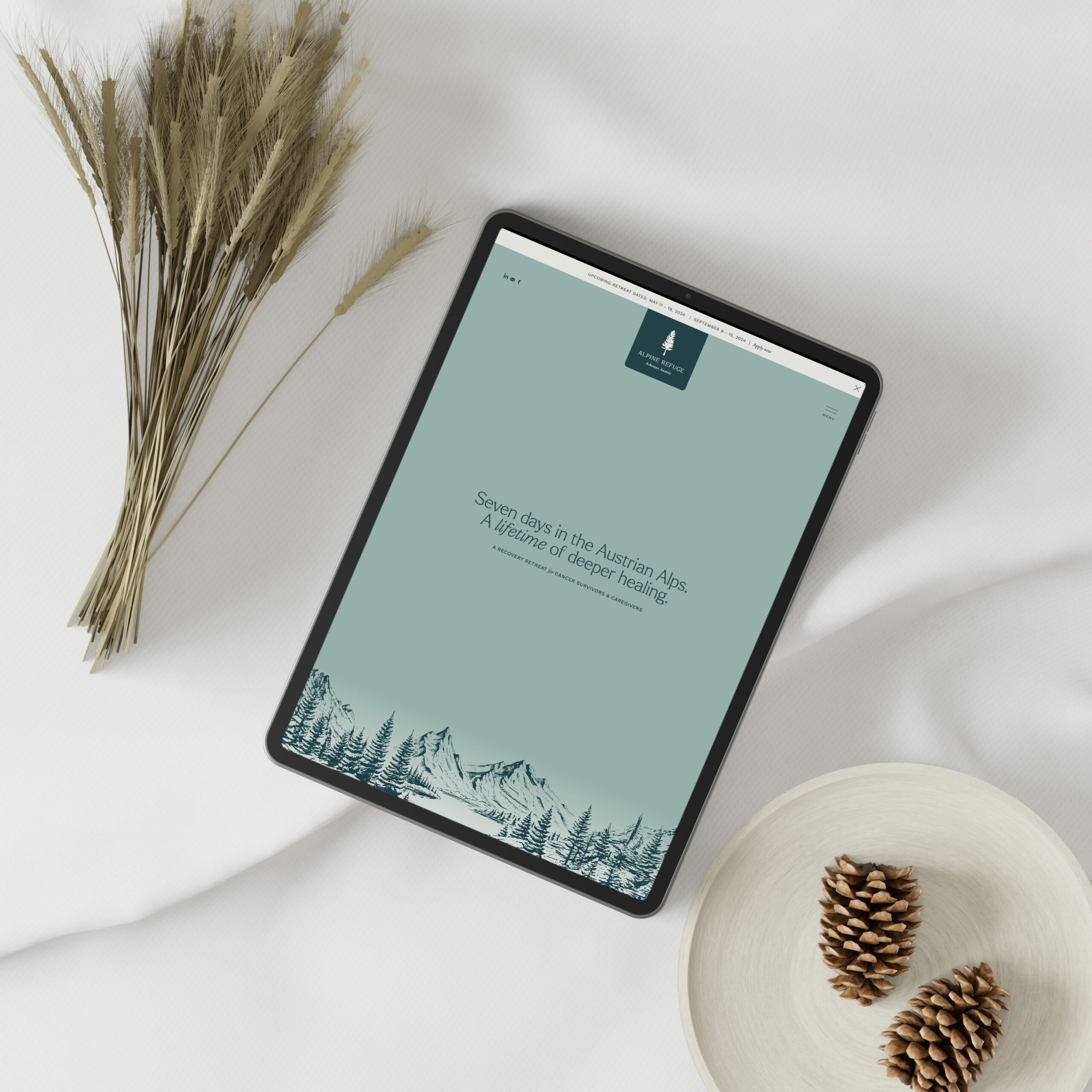
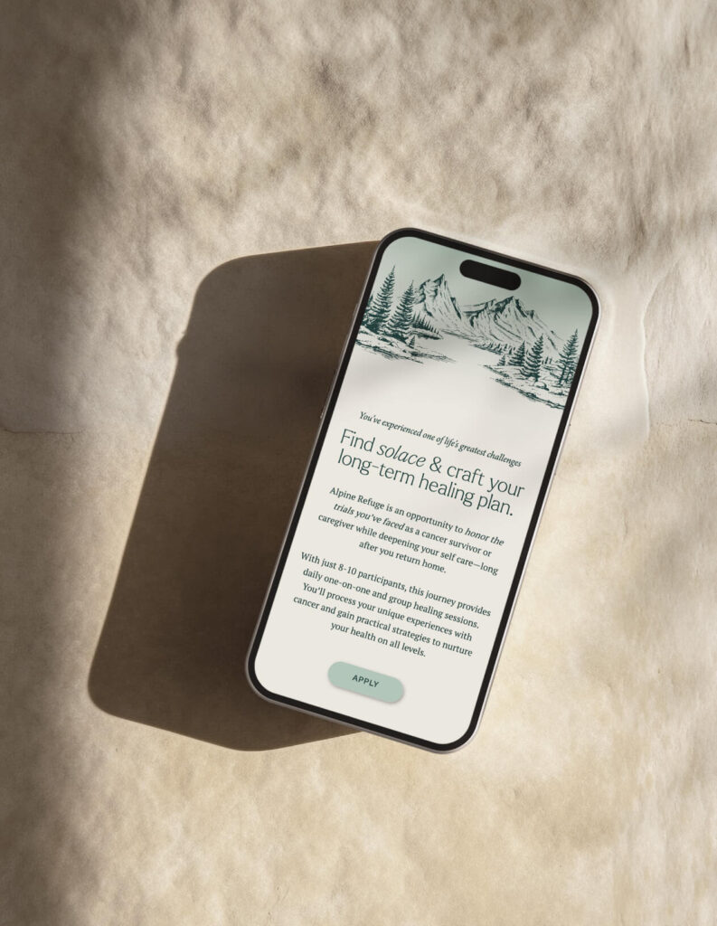
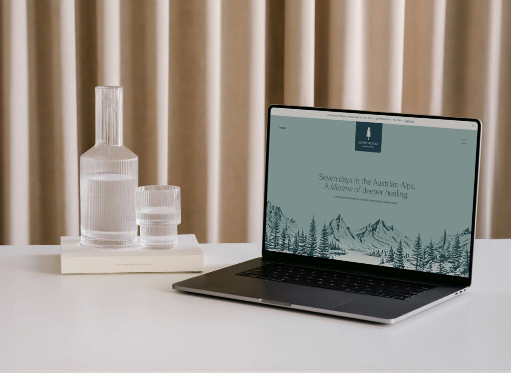
Alpine Refuge, nestled in the Austrian Alps, offers a sanctuary for cancer survivors and caregivers. This retreat focuses on providing an immersive and compassionate environment, fostering a sense of solace and refuge. With skilled oncology practitioners delivering personalised care, participants have the opportunity to delve inward and truly connect with their emotions. It’s a place for processing the experience of their journey with cancer, offering a tranquil space to find peace and rejuvenation.
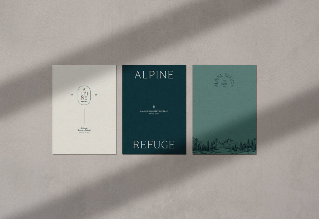
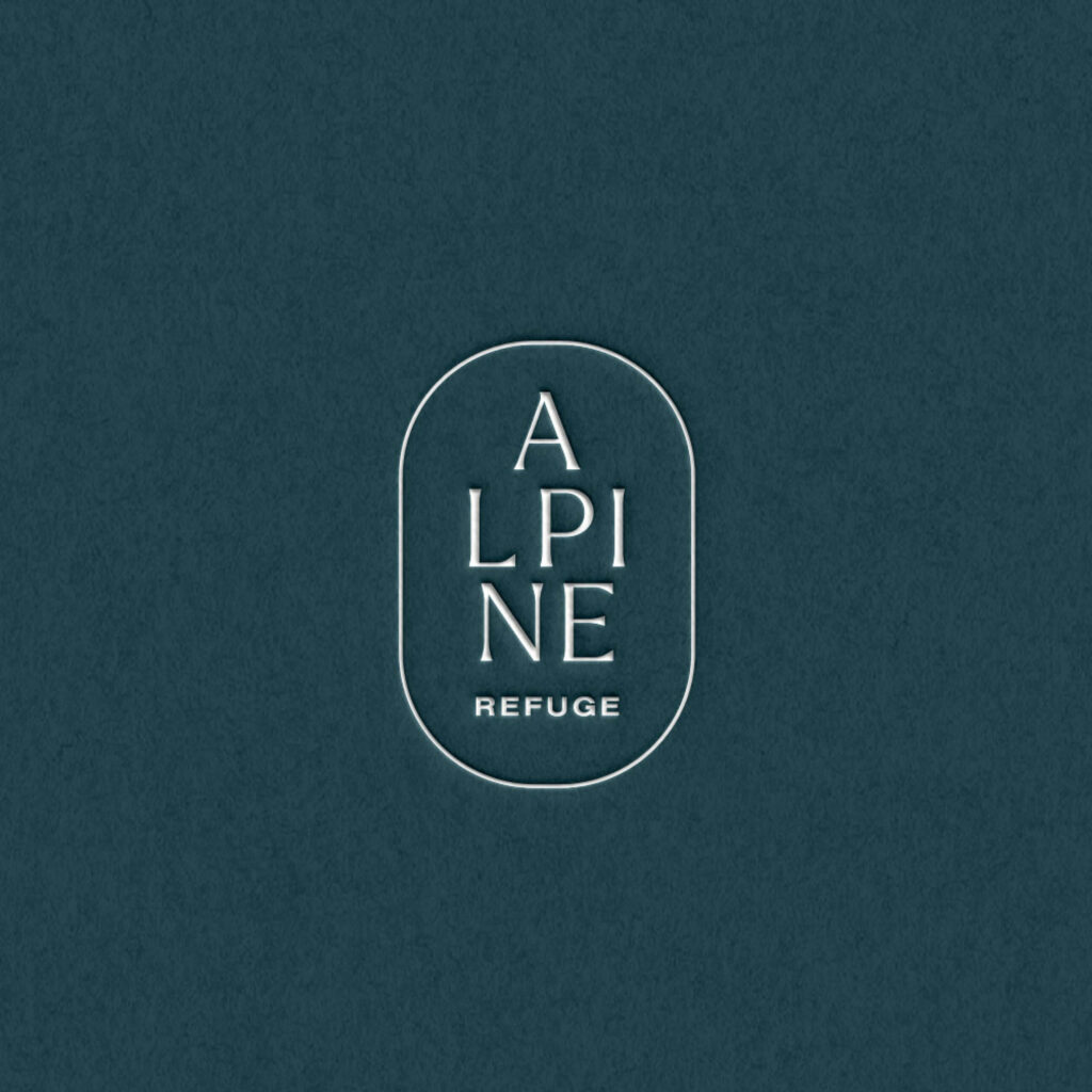
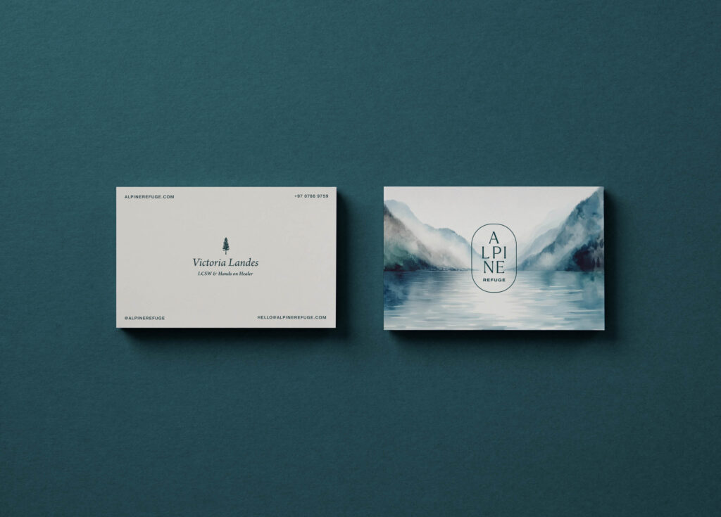
The brand identity reflects these core values through thoughtful design choices. The logo, designed with a modern, clean sans-serif font in uppercase, exudes clarity and strength while retaining warmth and an outdoorsy essence. This design approach ensures that the identity radiates simplicity, serenity, and professionalism—a testament to the retreat’s dedication to providing a quiet luxury that stands the test of time.
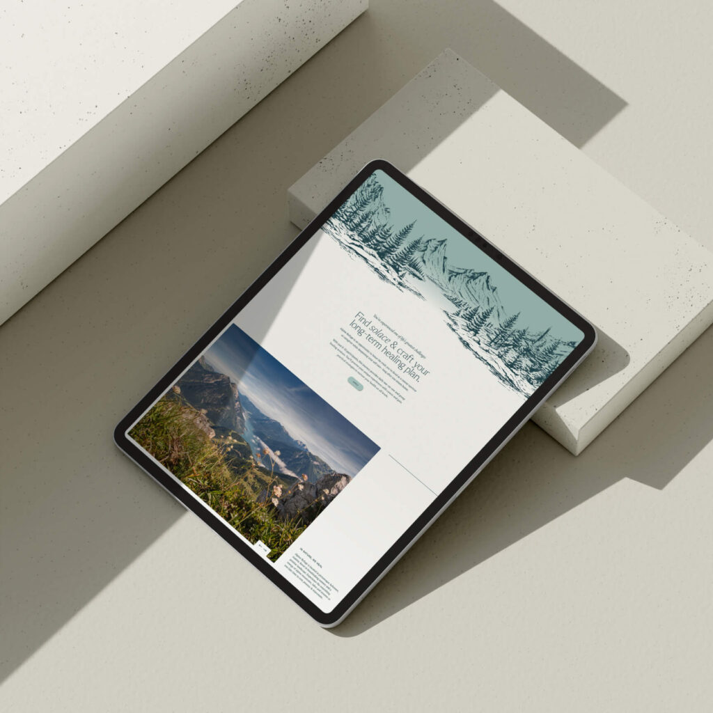
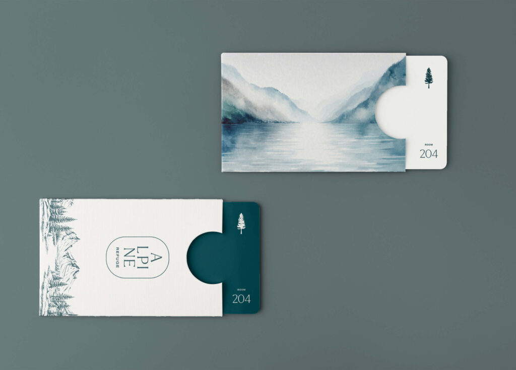
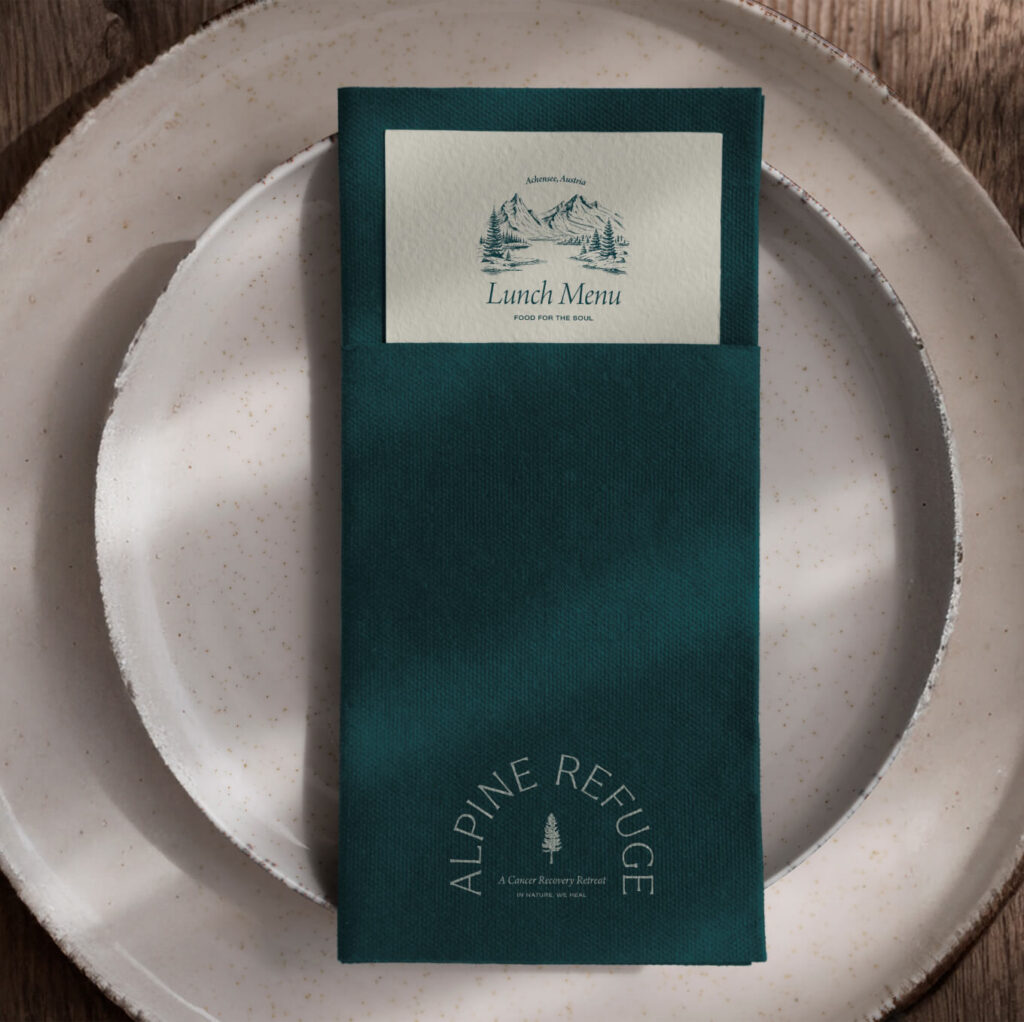
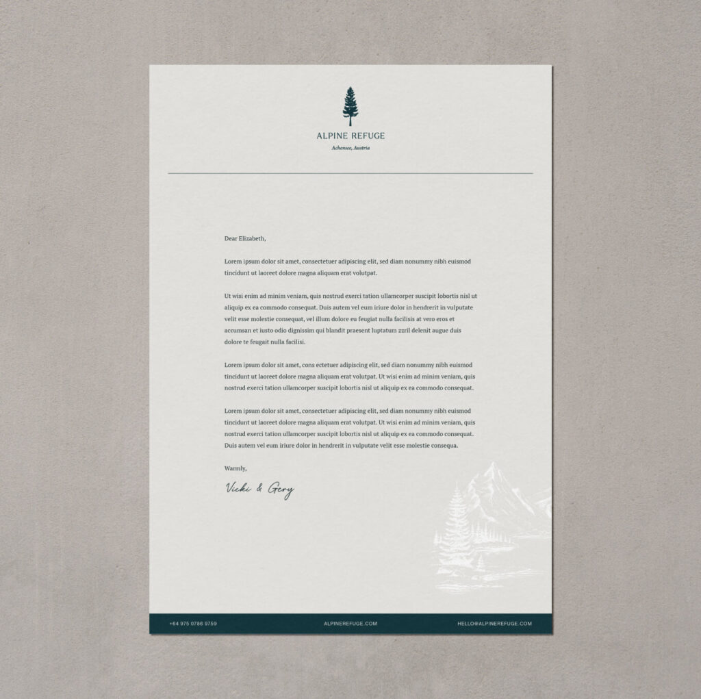
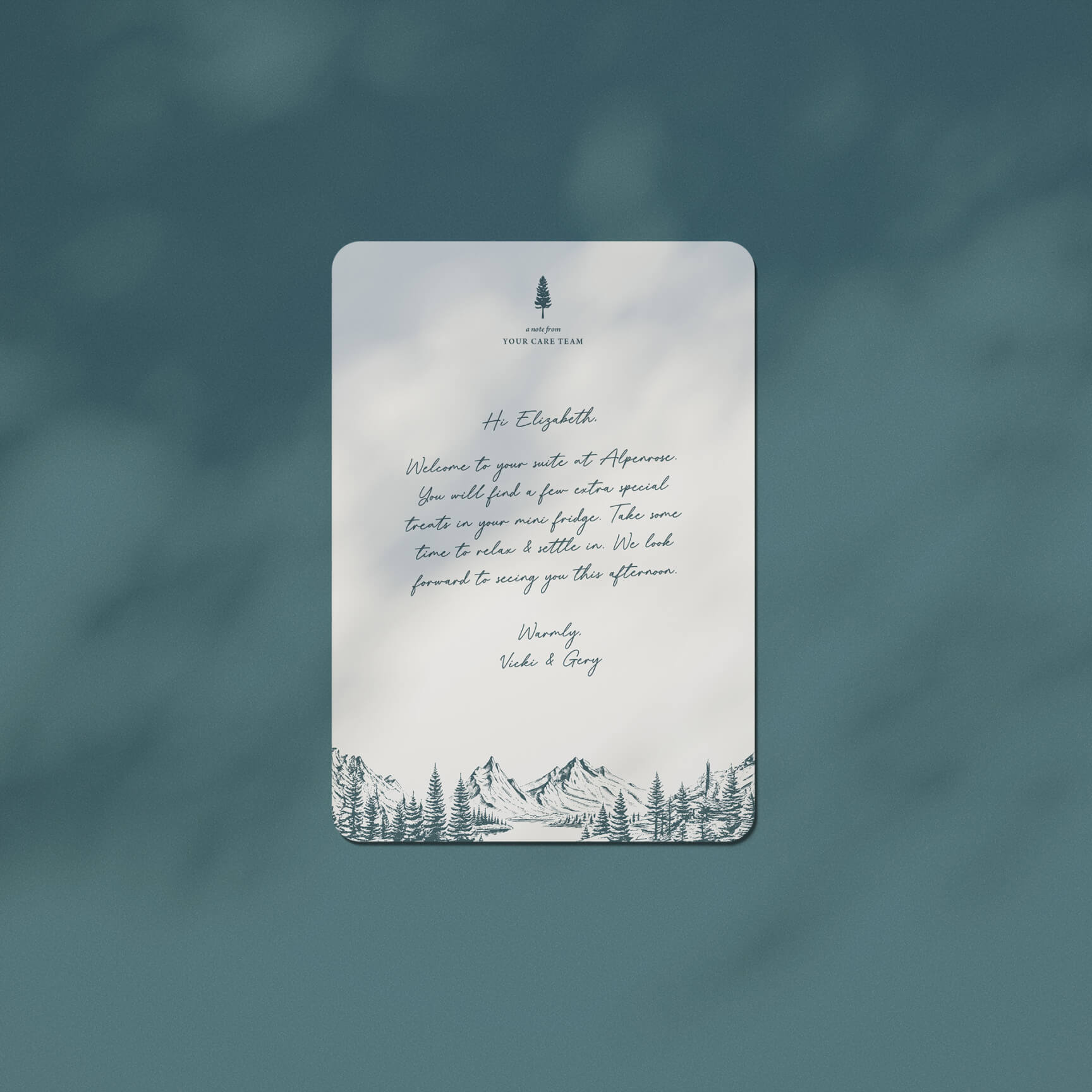
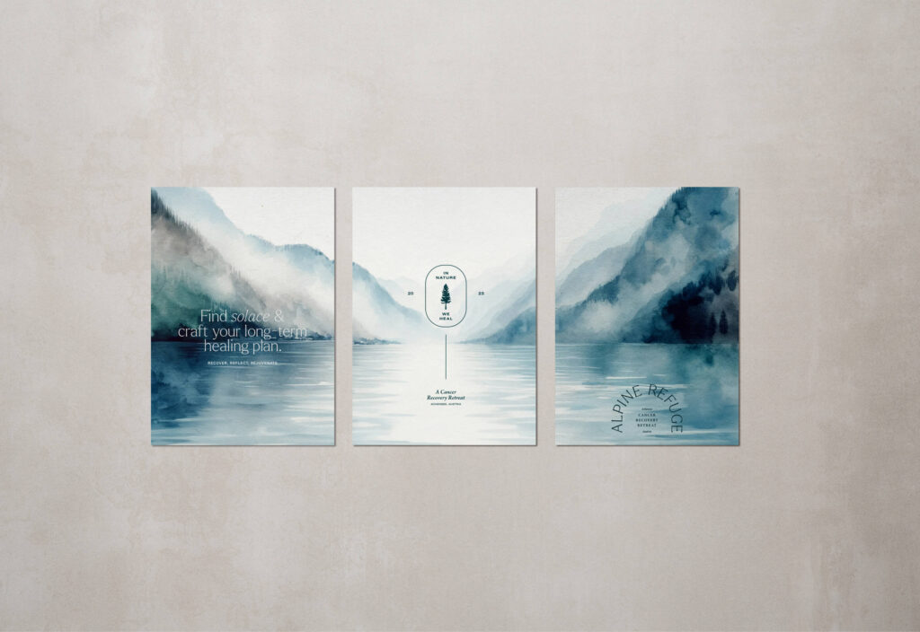
Incorporating a watercolour painting of the picturesque Lake Achen into the brand identity evokes the scenic beauty that participants will immerse themselves in during their stay. Additionally, an illustration depicting the tranquil landscape of lakes and mountains captures the essence of the Achensee and Alpenrose surroundings. To add depth and texture, the brand incorporates a unique pattern inspired by the rippled reflection of pine trees in the lake.
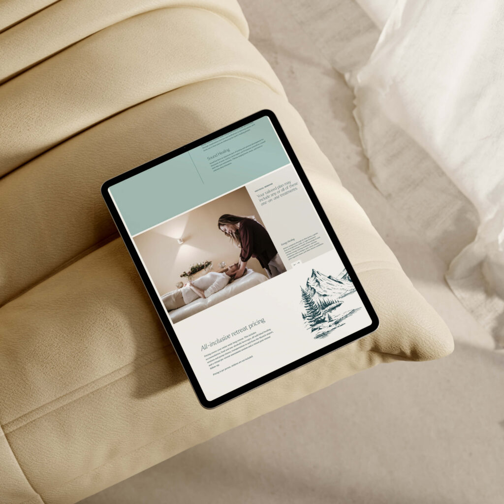
The project extends beyond visual elements, with the development of a user-friendly Showit website. This one-page site offers a captivating showcase of the surrounding Alpine landscape, as well as the interiors and amenities of the Alpenrose resort. The tagline, ‘In nature, we heal,’ encapsulates the retreat’s core philosophy.
The brand’s identity reflects a commitment to quiet luxury, tranquillity, and authenticity. This project showcases the seamless integration of visual design, nature’s beauty, and a profound dedication to offering an unparalleled healing experience.
At Hello Magic, we are in love with Showit. We’re all about building beautiful websites that attract your dream customers and the only thing better than a gorgeous online home is a gorgeous online home that converts. To get the best of both worlds, you need to know how to optimise your Showit site for SEO.
Excellent photography is one of the key ingredients in a show-stopping, stand-out-from-the-crowd kind of website. Here are our top tips for planning a brand photoshoot that will produce website-worthy images.

“Should I use Showit or Squarespace for my website?” This is a question we hear from many clients. And no wonder. Figuring out whether you should create a website using Squarespace or Showit is like trying to find a consensus over whether pineapple belongs on pizza or not.

Are you considering investing in professional branding or a rebranding project but unsure if it’s even worth it? It’s a valid concern. After all, there are many factors to take into account when making such an important decision for your business. To help you out, we’ll share with you a few cold, hard stats about the benefits of branding that just might convince you to take the plunge.

Template or custom: which is right for you? In this post, we compare all the differences between a custom Showit design and a Showit premade template to figure out which option is best for you and your business.

At Hello Magic, we are in love with Showit. We’re all about building beautiful websites that attract your dream customers and the only thing better than a gorgeous online home is a gorgeous online home that converts. To get the best of both worlds, you need to know how to optimise your Showit site for SEO.
Are you considering investing in professional branding or a rebranding project but unsure if it’s even worth it? It’s a valid concern. After all, there are many factors to take into account when making such an important decision for your business. To help you out, we’ll share with you a few cold, hard stats about the benefits of branding that just might convince you to take the plunge.